Category Settings
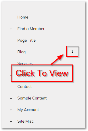
Category Groups (also referred to as Categories) are groups of related Products or Articles that are used to manage Inventory, apply Sales & Promotions and allow your visitors to perform advanced searches using Tags. Categories are attached to Pages and can be accessed via the Site Tree:
Note
A Category is automatically created and attached to every Page on your site. You cannot directly add or remove Categories.
What's in this article
Adding and Removing Items from a Category
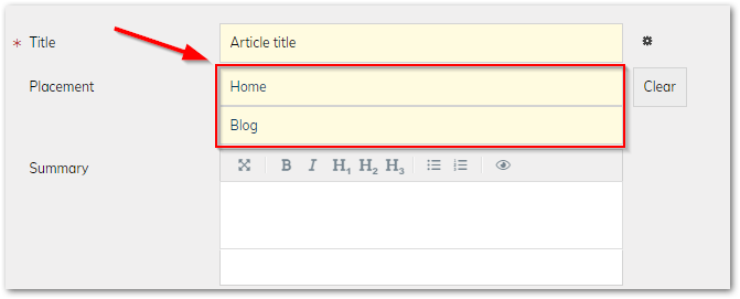
When creating or modifying an Article or Product, the "Placement" determines which Categories it belongs to:
Displaying a Category on your Site
When viewing a Page that has a Category with at least one Product or Article, the items will automatically be shown below the page content, along with the filtering & sorting options defined in the Category's Settings. You can also display Categories as Featured Content on any Page, Article or Product.
Below is an example of a Page that contains a Product Category:
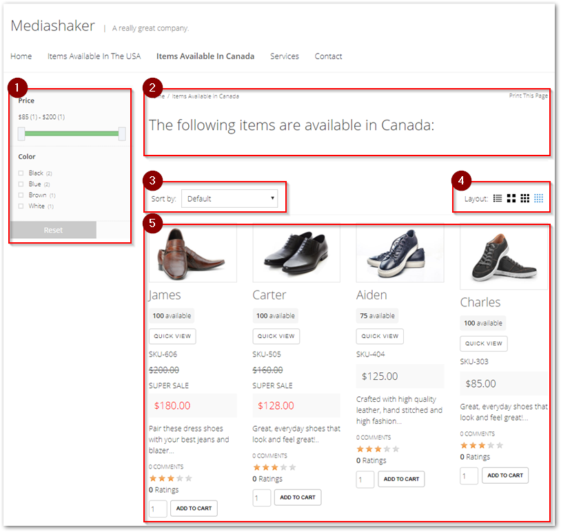
- Tag Filters: If enabled in Category Settings, allows the user to filter the items in the Category based on their Tags.
- Page Content: The Page's content.
- Sort Options: If enabled in Category Settings, allows the user to sort the items in the Category by their title or price.
- Layout Options: If enabled in Category Settings, allows the user to change the layout of the items in the Category.
- Item List: The Products or Articles in the Category.
Category Settings
To edit the settings for a Category, open it from the Site-Tree, then click "Category Settings":

Basic Settings
Configure the visibility / security of the category and how it will be displayed:
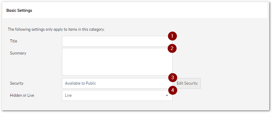
- Title: The title that will be shown above this category when it is displayed or featured.
- Summary: The summary that will be shown above this category (below it's title) when it is displayed or featured.
- Security: Restrict who can view this Category. this is similar to the Page Security Settings.
- Hidden or Live: Control whether the Category is visible or not. This is similar to setting up a hidden page.\Column Layouts
Column Layouts
Select the number of columns to use when displaying the Category or allow the user to configure the layout themselves:
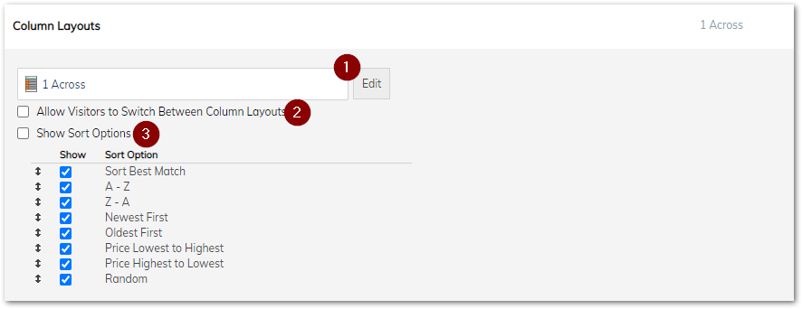
- Edit Layout: The default number of columns to use when displaying this Category.
- Allow Layout Switching: If checked, allows the user to change the number of columns being used to display the Category.
- Show Sort Options: If checked, allows the user to change the sort order of the items in the Category.
Category Pricing & Specials
Configure Sales that apply to every Product in the Category. Sales will have no effect on Categories that only contain Articles. Refer to the section on Sales & Promotions for more information.
Tag Display & Filter Settings
Configure how the items in the Category will be filtered. Tags must be applied to the Products or Articles in the Category before they can be filtered:
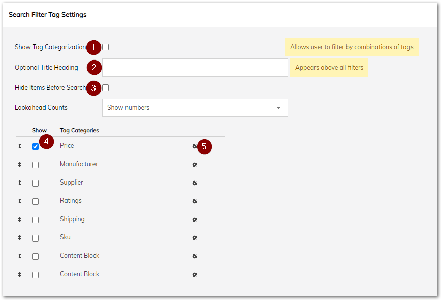
- Show Tag Categorization: If checked, the user will have the option of filtering the items in the Category based on their Tags.
- Title Heading: The title that will be shown above the filter settings.
- Hide Items Before Search: If checked, the user will not see any of the items in the Category until they have selected at least one Tag.
- Tag Categories: Tags Categories that are checked here will be available to the user as filters and can be used in any combination.
- Advanced Tag Settings: The display settings for each individual Tag Category (see below).
Advanced Tag Settings
Configure the display settings for each Tag Category:
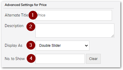
- Alternate Title: The text to display for this Tag Category.
- Description: A user-friendly description of the Tag Category.
- Display As: The type of control to use for this Tag. The available controls are:
- Checkboxes: Each Tag will be a checkbox. Allows multiple Tags from the same Tag Category to be selected simultaneously.
- Radioboxes: Each Tag will be a radio button. Allows only one Tag from the Tag Category to be selected at a time.
- Slider: The Tags will be arranged in order on a slider. Useful for numeric Tags.
- Double Slider: The Tags will be arranged in order on a slider that has both a minimum and maximum value. Allows for a range to be selected.
- Dropdown: The Tags will be displayed in a Dropdown list.
- Date: Allows the user to choose a date on a calendar.
- Text Field: Allows the user to type a value into a textbox. Items will be displayed if the text matches all or part of one of the Tags in the Tag Category.
- Multiple Choice Dropdown: The Tags will be displayed in a Dropdown list that allows for multiple items to be selected.
- Number to Show: The number of Tags to show for this Tag Category. By default, all the Tags will be displayed.
